Personal Spotify Streaming
Description
In this project, I embarked on a journey to analyze the listening trends of my friend, Nour, from 2018 to 2023. I gathered a massive dataset consisting of a staggering 156,100 songs played on Spotify. The objective was to create an interactive and informative Tableau dashboard that would showcase Nour's musical evolution over the years.
Tools Used
![]() Tableau
Tableau
![]() Excel (Power Query)
Excel (Power Query)
My Role
To begin the project, I received 9 .JSON files containing the raw
listening data from Nour's Spotify account. To make the data easily
accessible and ready for analysis, I employed Power Query, a
powerful data transformation tool. Through this process, I
successfully transformed the data into a user-friendly Excel data
source. This data preparation step laid the groundwork for the
subsequent dashboard creation.
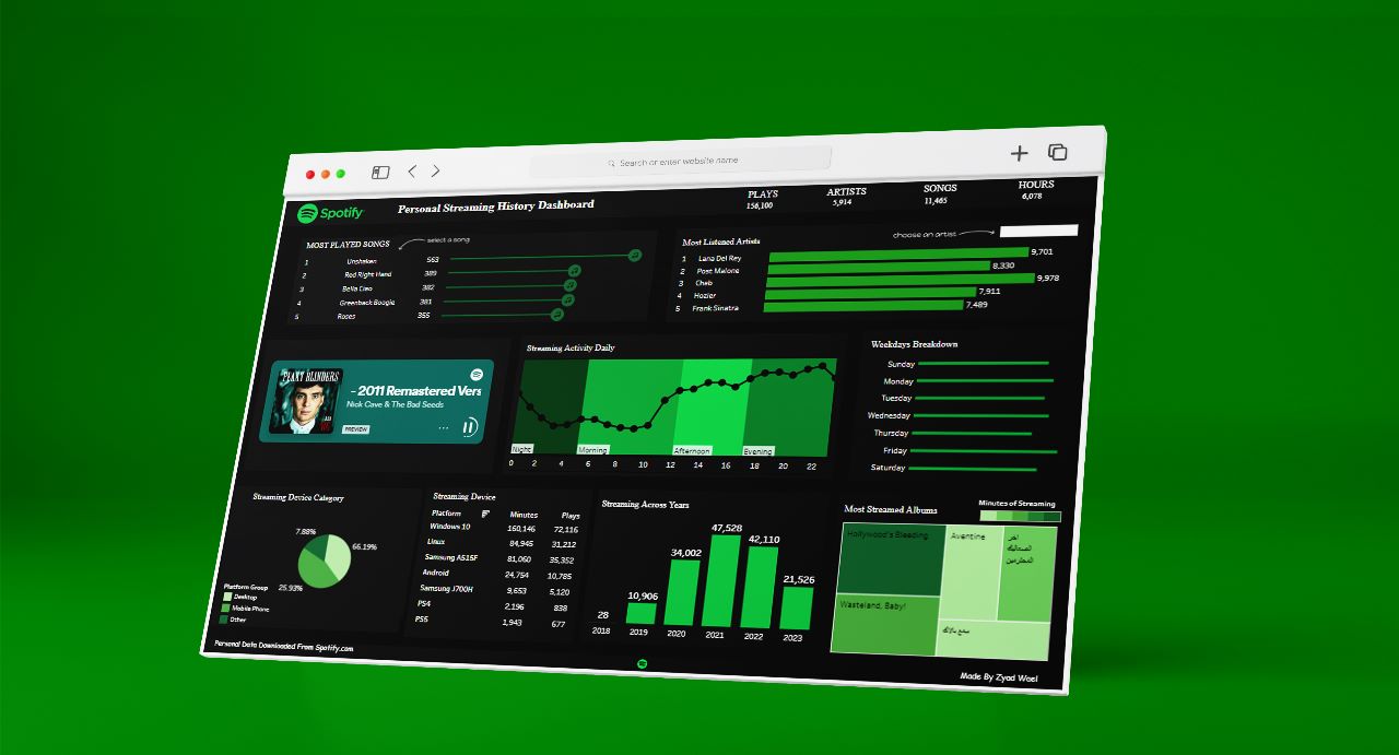
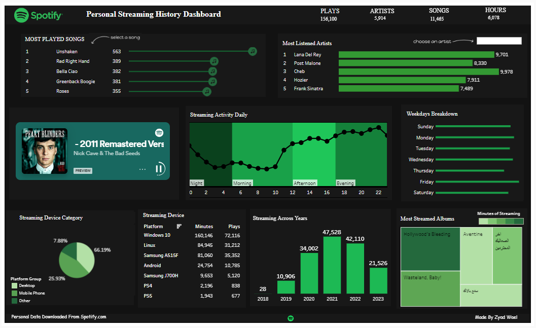
The focal point of this project was the creation of an interactive
Tableau dashboard. Leveraging the prepared Excel data, I designed a
visually appealing and user-friendly dashboard. The dashboard
boasted an array of features, including various filters and
drill-down capabilities. These interactive elements allowed users to
explore Nour's listening habits in a more personalized and
insightful manner.
The Tableau dashboard served as a gateway to explore Nour's musical
journey over the years. By utilizing the provided filters and
drill-down features, users could navigate through Nour's extensive
playlist history. Whether interested in a specific year or a
particular genre, the dashboard provided a seamless and immersive
experience, catering to each user's curiosity.
To enhance the dashboard's appeal and authenticity, I integrated a
touch of Spotify magic. By embedding the Spotify player directly
into the dashboard, users could listen to Nour's tunes while
exploring the data. This feature not only made the analysis more
engaging but also offered a genuine feel to the entire experience.
In conclusion, this project showcases my proficiency in data
analysis and visualization, using tools like Power Query and
Tableau. The interactive dashboard offers a unique and captivating
glimpse into Nour's listening trends from 2018 to 2023. The
combination of data exploration, user-friendly features, and the
embedded Spotify player makes this project a standout addition to my
portfolio, highlighting my ability to turn raw data into an
insightful and enjoyable experience.